
How to decorate your interiors with accent colors!
Accent colors can be hard to work with. This is why many people are afraid to use bright colors in interiors because if done badly it can ruin the interiors. Today we will give you some ideas that will help you get over the fear of accent colors.Accent colors can be hard to work with. This is why many people are afraid to use bright colors in interiors because if done badly it can ruin the interiors. Today we will give you some ideas that will help you get over the fear of accent colors.
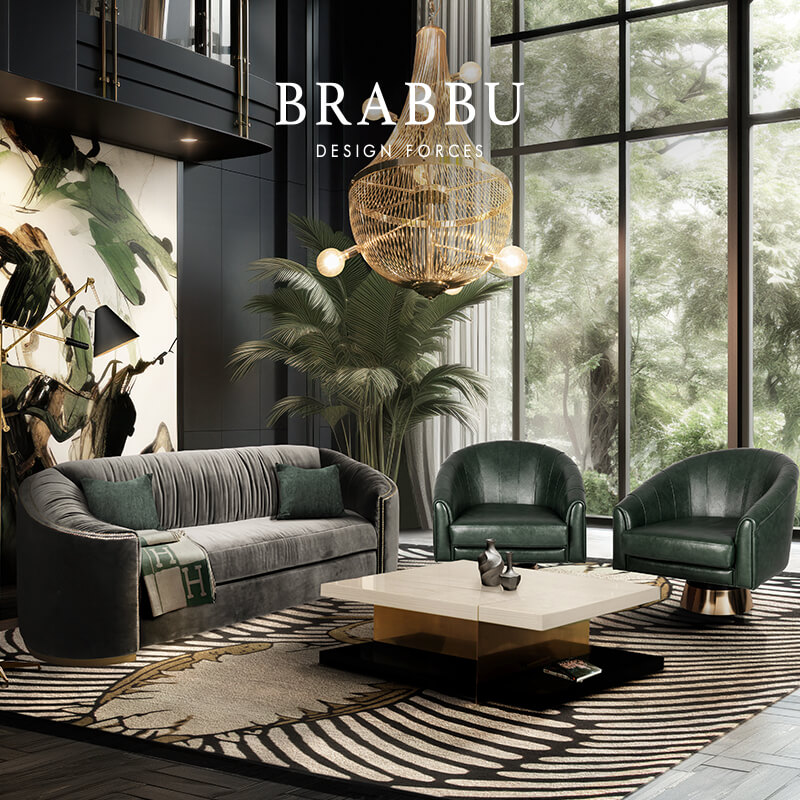
To start off, this dark red sofa by Brabbu. You can see that the rug matches the color of the sofa and by adding the cushions and the blankets we broke up the color creating a more coherent interior design.


Now for something more adventurous. These chairs, which are also by Brabbu are very loud. Their design is eccentric and so is their bright color. By keeping all the surrounding colors more muted and subtle we leave the chairs the room they need to make an impression.

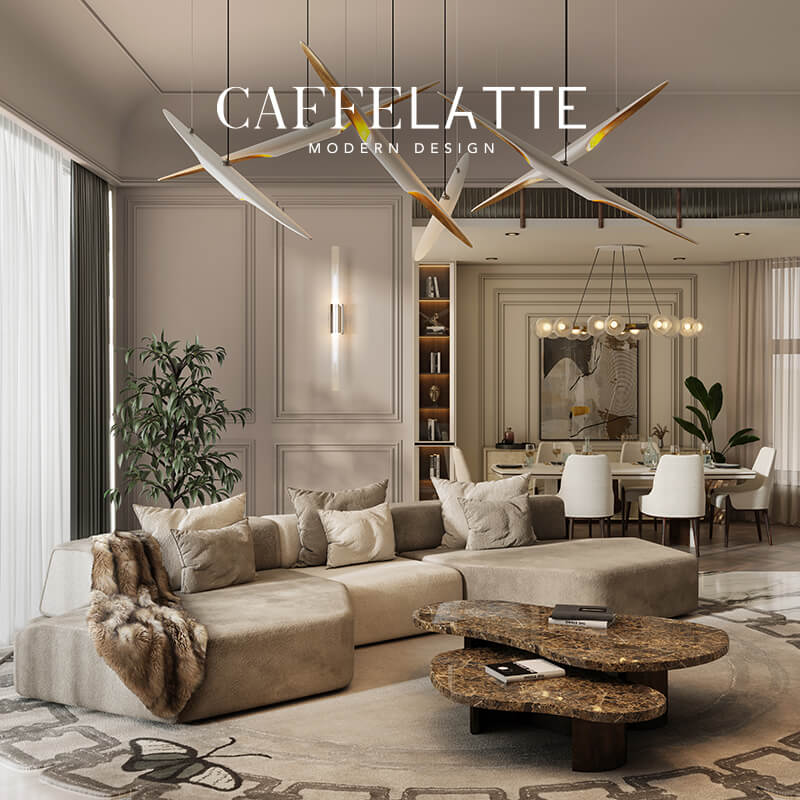
In this picture we used the same trick from before. The blankets and cushions draw a connection between the sofas and the room and the general natural color of the sofas also fits the room’s ambiance perfectly.

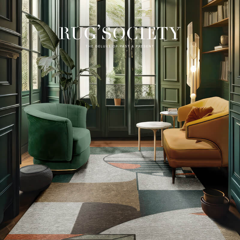
Now this is where you can go over board. In this hotel ambiance we went all out and went for green. By breaking up the green through the marble wall piece and the lamps, we manage to make the color less dominating.

See also: Summer trends: Go for a green bedroom!
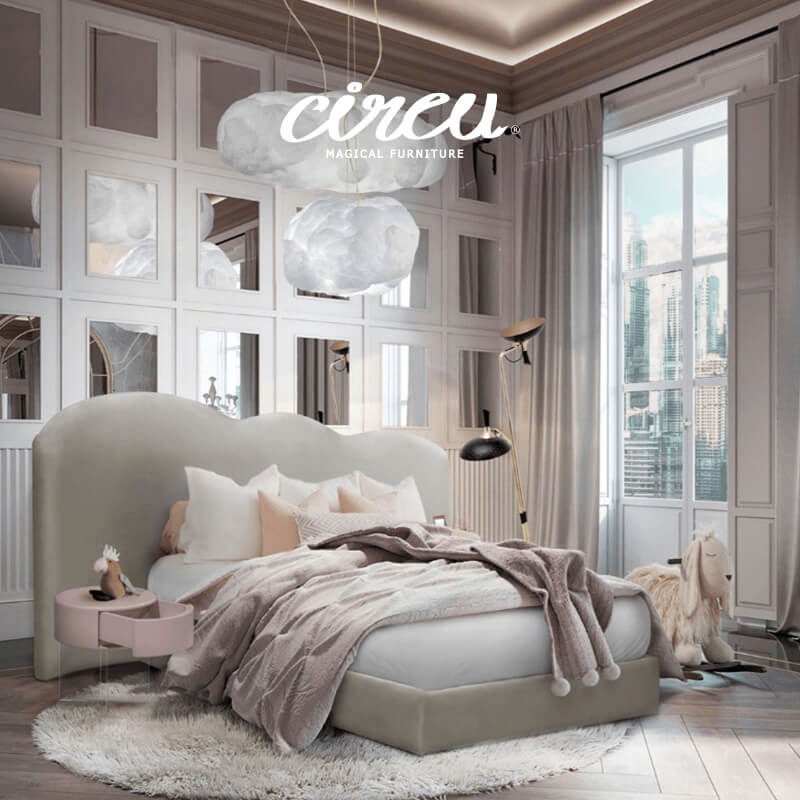
Another way in which you can get away with using a lot of color is by using different shades of the same or similar color and by generally keeping the colors muted. In this Circu ambiance you can really see a lot of pink tones but because of the softness of the tone used and only having small accents in stronger tones, the room seems light and not overwhelming.


If you really want for a color to stand out you can use the same trick we did in this picture. Even though the chairs have a rather subtle tone, they don’t seem to overwhelm you. We achieved this by using a almost monochrome palette for the rest of the room.

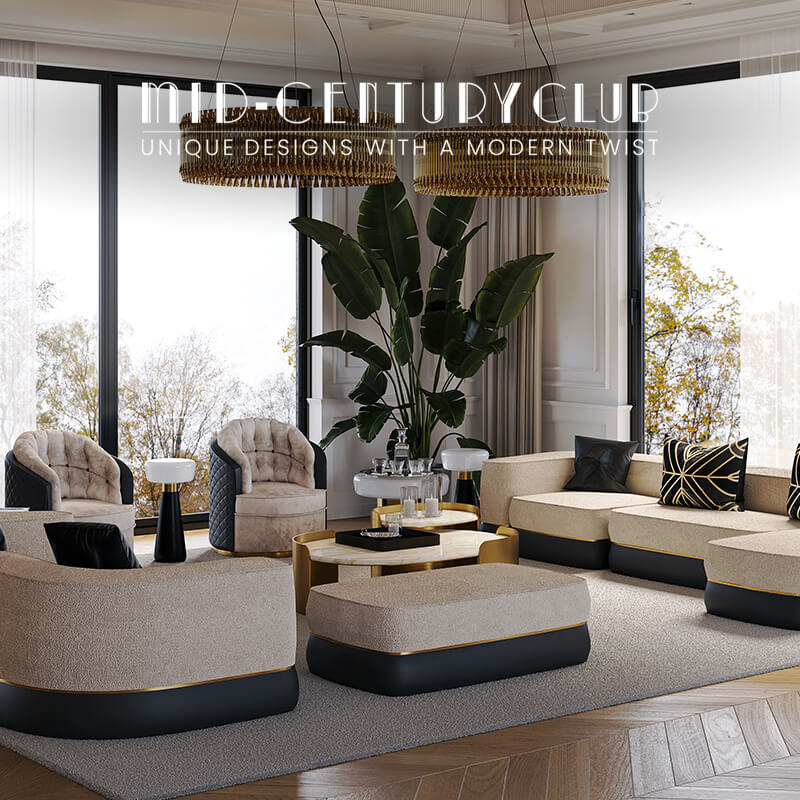
In this ambiance we used two accent colors but by keeping them in the lower part of the room, it keeps everything grounded. Again we replicated the accent colors in other places to pull everything together. Having the bright colors in the lower third of the room in this picture we manage to give the room a foundation. The upper two thirds seem very light and airy. This also helps to make the colors less overwhelming.

See also: Design Inspiration for Design Lovers
We want to encourage you to use more colors because colors are amazing and with summer just around the corner, you are sure to encounter bright colors to be a very hot trend. We hope these tips helped you make your interior design projects more colorful.